Wednesday, August 25, 2010

Drawing boxplots, violin plots using R Part 1

A box plot is a graphical display of the distribution of data, showing all the quartiles an possible possible outliers. Assuming the box plot is drawn
vertically, The rectangular box lower edge denotes the first quartile, while the upper edge denotes the third quartile. The median is denoted by a line inside the box. Some versions also indicate the position of the arithemetic mean by a cross or a dot. Whiskers are drawn up to the data within 1.5(fs) of the lower and upper quartiles. where fs is the fourth spread, the difference of Q3 and Q1. Data points beyond these minimum and upper ranges are drawn for each data beyond these range and are labelled outliers. The box plot however cannot display the distribution of the data especially for multimodal data.
A Boxplot can be drawn for each column of a matrix.

The violin plot removes any shortcomings of the boxplot by adding a KDE (kernel density estimator to outline the distribution of the data. R usually draws
only a boxplot for one vector only. There are at least two libraries which offers violinplots. One is the violinplot function from the UsingR package of Verzanni. Another is the vioplot library which offers the vioplot function.

Here is an illustration of the differences between boxplot, violinplot and vioplot

library(UsingR)
library(vioplot)

png("box-viol.png", 6*72, 6*72)
X <- rbind(rnorm(50, 5, 2), rnorm(25, 1), rnorm(10, 3))
X <- as.vector(X)
violinplot(X,X,X)
vioplot(X, at=2,col="green", add = T)
boxplot(X, at=1,col="red", add = T)
dev.off()
Three violinplots are shown and the boxplot and vioplot are superimposed on the first and second plot respectively.
Box and Violin Plots example
Notice that in the desire to look more a violin, the vioplot will sometimes cut off at the Q3 + 1.5 fs or at the Q1-1.5fs, which may hide any outlier points!


orientation? positioning? outliers? matrix?dataframe?
boxplotbothyesyesyesyes
violinplotvertical onlyno*nonoyes
vioplotbothyesnonono


In orientation, the box plot and vioplot can be drawn horizontally and each ca

n be positioned at a specific location on the x or y axes using the graphics parameter at="value". As we can see in the above figure, for outliers, the vioplot may stop at the fence values creating a flat top or flat bottom. and hiding the extreme values specifically the minimum and maximum value in the data.The violin plot does show the minimum and maximum of data, but it is hard to know where the fs spreads lie. Both violin plot and vioplot cannot handle input matrix data. You have to specify each column of the matrix to these functions.

The boxplot may have an optional notch to emphasize the location of the median.

In my opinion, a violin plot with a box plot superimposed is the current best way to show distribution and any muliple modalities of the data.

We are still wondering what input format we shall make for our online solver at extreme-solvers.blogspot.com, which we shall show in Part 2 of this article.

We hope that the developers of these plots will implement other features available in the others, like vioplot able to do dataframes.

Monday, August 23, 2010

Drawing scatterplots and sunflower pots with R

Scatter plot and sunflower plots differ only in that the latter draws a flower stem for each repeat of a data point. In other words, it is easy to see multipicities of data points hidden in a plain scatter plot. Points are compared up to a specified number of significant digits.

Here are examples of plain scatter plot and sunflower plots for the same data (two column xy coordinates)


1 3
1 3
1 4
1.5 4
1.5 4
1.5 4
1.75 5
1.75 1.25
2 5
2 6
2 6
2 6
2 6
2 6
2 8


Here is the scatter plot drawn for the above data. Count the points drawn with the points in the data. They don't match!


On the other hand, the sunflower plot will allow a viewer most of the time an idea of the number of points displayed in the graph. Here is the sunflower plot for the same data.


Our solver which offers a scatterplot/sunflower plot generation page is in
http://extreme.adorio-research.org/solvers/rplotpage/scatter/

Drawing three-dimensional plot specified by a function f(x,y) in R

Some of the plots described previously in this blog actually give visualizations of functions in two variables. Examples are the quiver and contour plots. Another one is a perspective plot which can be created by calling the appropriately named plotting function persp() of R.

Here is a simple example: f(x,y) = sin(x) + cos(y), whose figure is displayed below:


It can be quite messy to do it from the R console. The solver page provides a fill-in-the-blanks settings page which describe the figure. By way of illustration, here is the R code for the figure above with line numbers. Intermediate output is shown interspersed without a leading ">" prompt. This happens after the summary report for the z values.

0001 > png("tmpZzY7bz.png", width = (6)*72, height = (6)*72)
0002 > f <-function(x, y){sin(x) + cos(y)}
0003 > x <- seq(-10, 10, length.out = 100)
0004 > y <- seq(-10, 10, length.out = 100)
0005 > tridata <- outer(x, y, f)
0006 > z <- tridata
0007 >     summary(as.vector(z))
0008 Min.  1st Qu.   Median     Mean  3rd Qu.     Max.
0009 -1.99900 -0.79430 -0.04088 -0.06207  0.63990  1.99600
0010 >
0011 > z0   <- min(z) - (max(z) - min(z)) / 100
0012 > z    <- rbind(z0, cbind(z0, z, z0), z0)
0013 > x    <- c(min(x) - 1e-10, x, max(x) + 1e-10)
0014 > y    <- c(min(y) - 1e-10, y, max(y) + 1e-10)
0015 > fill <- matrix("green3", nr = nrow(z) - 1, nc = ncol(z) - 1)
0016 > fill[, i2 <- c(1, ncol(fill))] <- "gray"
0017 > fill[i1 <- c(1, nrow(fill)), ] <- "gray"
0018 > fcol <- fill
0019 > fcol[] <- terrain.colors(nrow(fcol))
0020 > fcol   <- fill
0021 > zi <- tridata[-1, -1] + tridata[-1, -ncol(tridata)] + tridata[-nrow(tridata), -1] +tridata[-nrow(tridata), -ncol(trida
0021 a)]
0022 >
0023 > fcol[-i1, -i2] <- topo.colors(20)[cut(zi, quantile(zi, seq(0, 1, len = 20 + 1)), include.lowest = TRUE)]
0024 >
0025 > persp(x, y, 1 * z, theta = 135, phi = 30, col = fcol, scale = FALSE, ltheta=-120,lphi=0,shade = 0.75, border = NA, tic
0025 type = "simple", box = FALSE)
0026 > title(main = "3D Plot", font.main = 4)
0027 > par(bg = "slategray")
0028 >
0029 > graphics.off()
0030 > #img tmpZzY7bz.png

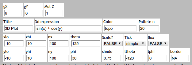
The solver page which generates 3d figures is at /solvers/rplotpage/trid.

The part of the menu page for the settings of 3d plots is shown here:

Drawing quantile-quantile qq plots with R

Quantile-quantile plots gives the most visually appealing method to view the extent of normality of a vector or a two-column matrix of data. Data is either a single column (Y) or two column (X, Y). If nvars is 1, will display qqnorm(y). Otherwise, if nvars is 2, will display qqplot(x,y). Data is always read row wise(byrow=TRUE).

Optionally, line passing thru Q1 and Q3 is drawn if Line? is TRUE. If data on X axis is TRUE, data values will be shown in X-axis otherwise on the Y-axis.


A qq plot may be generated by our solver at /solvers/rplotpage/qq

Drawing quiver plots with R

Our extreme solvers site solvers/rplotpage/quiver
allows one to draw a quiver plot or arrows plot over a displayed image of a function in two variables of the form $$fxy= f(x,y)$$. It is based on R routines by Ripley and Hand and illustrated in the addictedtor.org gallery from which our qpy code is based.

Here is an example for the function (or expression) $$fxy= \sin(x) + \cos(y)$$. Here we have the settings xlo=ylo = -2.0, xhi=yhi=2.0 and xby=yby = 0.2. The contour color is gray and the pallette for the image is terrain.colors. Here is the output image.


Note that we have shown a test code to generate quiver plots previously.

Generating quiver plots using R under Python

Here is Python code to generate an R script which in turn does the actual image generation.

"""
quiver-test.py
"""

def quiverfunc(fxy, x0, x1, xby, y0, y1, yby, pallette="terrain.colors", contourcolor="gray"):
   S = """
par.uin <- function() 
  # determine scale of inches/userunits in x and y
  # from http://tolstoy.newcastle.edu.au/R/help/01c/2714.html
  # Brian Ripley Tue 20 Nov 2001 - 20:13:52 EST
 {
    u <- par("usr") 
    p <- par("pin") 
    c(p[1]/(u[2] - u[1]), p[2]/(u[4] - u[3]))
 }

quiver2 <- function(expr,
                     x,
                     y,
                     nlevels=20, 
                     length=0.05, 
                     ...){

    z <- expand.grid(x,y) 
    xx  <- x
    x   <- z[,1]
    yy  <- y
    y   <- z[,2]

    fxy <- eval(expr) 
    grad_x <- eval(D(expr, "x")) 
    grad_y <- eval(D(expr, "y")) 

  dim(fxy) <- c(length(xx), length(yy)) 
  dim(grad_x) <- dim(fxy) 
  dim(grad_y) <- dim(fxy) 

  maxlen <- min(diff(xx), diff(yy)) * .9 
  grad_x <- grad_x / max(grad_x) * maxlen 
  grad_y <- grad_y / max(grad_y) * maxlen 

  filled.contour(xx, yy, fxy, nlevels=nlevels, 
    plot.axes = { 
      contour(xx, yy, fxy, add=T, col="gray", 
              nlevels=nlevels, drawlabels=FALSE) 

      arrows(x0  = x, 
             x1  = x + grad_x,
             y0  = y,
             y1  = y + grad_y,
             length = length*min(par.uin())) 

      axis(1) 
      axis(2) 
    },
    ...)
}

f <- expression( #expr) 
x <- seq(#x0, #x1,by= #xby) 
y <- seq(#y0, #y1,by= #yby) 
par(mar=c(3,3,3,3)) 
quiver2(f,x,y, color.palette=#pallette) 
graphics.off()
"""
   S = S.replace("#expr", fxy)
   S = S.replace("#x0", x0)
   S = S.replace("#x1", x1)
   S = S.replace("#xby",xby)
   S = S.replace("#y0", y0)
   S = S.replace("#y1", y1)
   S = S.replace("#yby",yby)
   S = S.replace("#pallette",pallette)
   S = S.replace("#contourcol", contourcolor)
   return S 

Rcode = 'png("temp.png", 6 *72, 6 *72)'
Rcode +=  quiverfunc("(3*x^2 + y) * exp(-x^2-y^2)", "-2", "2", "0.2", "-2", "2", "0.2", pallette="terrain.colors", contourcolor="gray")
print Rcode
Save the file to "test-quiver2.py". Then to run it, type python quiver2.py > out.R. Then issue R < out.R --no-save. The generated image is in temp.png. Finally, display it using the imagemagick tool: display temp.png.

Sunday, August 22, 2010

Drawing pie plots with R

Pie plots are the most unadorned graphs in R. Those developers of R even warn of using pie plots for conveying information and instead recommend using a bar plot or dot chart.
Here is an example of a pie chart drawn using R.


In the page for pie chart generation, the radius of the pie is relative to the size of the graph and thus has a maximum value of 1.